For God and Country(770) 466-47284635 Highway 78, Loganville, GA

Internal reference

Brand Guidelines

How to write about, and design for, American Legion Post 233. Written for anyone producing Post materials — flyers, social posts, letterhead, or pages on this website.

Our name

The Post has a formal name and an everyday one. Both are correct; the difference is register. Getting the capitalisation wrong is the most common mistake in Post materials.

Correct and incorrect name forms
CorrectNot thisNote
American Legion Post 233Post 233 Legion HallEveryday short form — use this in most copy
Barrett-Davis-Watson Post No. 233Barrett Davis Watson PostFormal name. Hyphenated, "No." abbreviated
The American Legionthe American LegionCapital "The" is part of the organisation’s name
Sons of The American LegionSons of the American LegionCapital "The" here too
Patriots' GrillPatriot’s GrillApostrophe after the s — plural possessive
Legion Familylegion familyThe collective term for Post, Auxiliary, SAL and Riders

Why the namesakes matter

Barrett, Davis and Watson were three Loganville men who did not come home. The naming committee chose them in 1948 "for the ones who did not come back". The formal name is not decoration — use it in full on anything ceremonial, official, or memorial.

Read the Post history

Emblem

The American Legion emblem is a registered trademark of The American Legion. Its use is governed by national policy, not by this document — including how it may be altered, what it may be placed next to, and whether it can appear on merchandise or commercial material.

Before using the emblem on anything that leaves the Post, check the current national emblem guidance at legion.org or with the Department of Georgia. When in doubt, ask rather than adapt it.

General rules

  • Do not stretch, recolour, rotate, or crop the emblem
  • Keep clear space around it — nothing crowding the edges
  • Do not place it on a busy background that reduces legibility
  • Do not combine it with other logos into a new composite mark

Colour

A Legion post serves veterans of every branch, so the core palette must not read as any one service. The unifying choice is gold: every U.S. branch carries gold or golden yellow in its official colours, which makes it the one accent that belongs to everyone.

Gold sits on field-uniform neutrals — olive drab and khaki — which read "military" without claiming a branch, with flag red reserved for calls to action.

Hex values are screen approximations. Official service colours are specified in uniform and heraldry documents (Pantone and cable numbers), not hex.

Olive drab

Structure — headers, dark bands, borders

  • --od-900#1a2014Footer, top bar
  • --od-800#252d1bBingo band, dark panels
  • --od-700#333d24Primary — header, hero
  • --od-600#44512fCard top rules
  • --od-500#58683eMuted accents
  • --od-400#6f8052Dividers on dark

Khaki

Surfaces — page and section backgrounds

  • --khaki-050#faf8f2Page background
  • --khaki-100#f3efe3Tinted sections
  • --khaki-200#e7e0cdBody text on dark
  • --khaki-300#d5cab0Borders
  • --khaki-400#b9ab8cMuted rules

Brass

The unifier — emphasis, and Bingo specifically

  • --brass#b0882fBingo, feature nav, buttons
  • --brass-lit#d4a83cAccents on dark
  • --brass-deep#8a6a22Eyebrow text on light

Action & depth

Calls to action, and the flag reference

  • --red#8d2b21Primary CTA, Donate
  • --red-dark#6f2018CTA hover
  • --navy#1c2b40Flag blue — service ribbon
  • --navy-deep#101a29Deep panels

Branch colours

Each service has its own official colours, available as an extended palette. Use them only to identify a specific service — branch birthday observances, honor guard details, memorial notices, member service tags. Never as general decoration, or the neutrality of the core palette is lost.

Navy, Air Force and Coast Guard blues are nearly identical, which is why each branch also has a secondary colour. Pair the two and the services separate instantly. The branch name is always written out as well — colour never carries the meaning alone.

  • U.S. ArmyBlack and gold; Army green in the field
    • --army#4b5320Primary
    • --army-dark#333a13Text on light
    • --army-lit#8f9a4eText on dark
    • Secondary#ffcc01Army gold
  • U.S. Marine CorpsScarlet and gold
    • --usmc#a02218Primary
    • --usmc-dark#7a1911Text on light
    • --usmc-lit#d9564aText on dark
    • Secondary#ffcc00USMC gold
  • U.S. NavyNavy blue and gold
    • --navy#002b5cPrimary
    • --navy-dark#001b3dText on light
    • --navy-lit#4a7fb5Text on dark
    • Secondary#c5b358Old gold
  • U.S. Air ForceUltramarine blue and golden yellow
    • --usaf#00308fPrimary
    • --usaf-dark#001f5eText on light
    • --usaf-lit#5b86d6Text on dark
    • Secondary#ffc72cGolden yellow
  • U.S. Coast GuardCoast Guard blue, with racing-stripe orange
    • --uscg#003087Primary
    • --uscg-dark#001f57Text on light
    • --uscg-lit#5583c7Text on dark
    • Secondary#e4610fRacing-stripe orange
  • U.S. Space ForceDark blue and silver
    • --ussf#1a2841Primary
    • --ussf-dark#0d1522Text on light
    • --ussf-lit#6b7b96Text on dark
    • Secondary#b8bfc9Silver

Typography

Headings

Bitter

A slab serif — sturdy and institutional, reading like stencilled crate markings and memorial lettering. Used at 700 weight with slightly tight tracking and balanced line wrapping.

Body & interface

Source Sans 3

Neutral and highly legible, with the plainness of a service document. Used at 400 for body, 600–800 for labels and buttons.

Scale in use

Bingo at Post 233

Weddings, receptions, parties

Robert Boss Pavilion

Sundays & Wednesdays · Open to the public

Body copy sits near 65 characters per line for comfortable reading. Uppercase labels get generous letter-spacing so they stay legible at small sizes.

Both faces load from Google Fonts with real fallback stacks — Georgia for Bitter, system sans for Source Sans 3. If a page renders in the fallback, the font link is missing.

Voice

These principles are drawn from how the Post already writes — its flyers, its older pages, and its memorial content. They are a description of the Post's voice, not an invention.

Plain and direct

Say what a thing is, when it happens, and what it costs. The Post’s own flyers do this well: "First ball drops 7:30 PM", "$10 admission", "Doors open at 6".

Do Bingo runs Sunday at 2:00 p.m. and Wednesday at 7:30 p.m.

Don't Join us for an exciting evening of gaming entertainment!

Everyone is welcome

The Post repeats this constantly and it matters commercially — bingo, the Grill, dances and rentals are open to the public. Say so explicitly; people assume a Legion post is members-only.

Do Open to the public — no membership required.

Don't Members and their guests are invited.

Connect spending to purpose

Every flyer ends with a version of "supporting our veterans and community". Money spent here funds programmes, and saying so is the strongest reason to choose the Post over a commercial venue.

Do Rentals directly fund scholarships and veterans assistance.

Don't Competitive rates available.

Drop the volume for memorial content

Promotional copy can be loud. Anything touching service, sacrifice, POW/MIA, or the Post’s namesakes is written plainly and without exclamation marks. Compare the Missing Man Table page to a bingo flyer — that gap is deliberate.

Do Until the day they return home, or find eternal peace, we will remember.

Don't Check out our AMAZING memorial display!

Never overstate what we know

This site was rebuilt after years of stale information went unnoticed — including bingo nights that had stopped running. If a detail is not confirmed, leave it out rather than guess.

Do Call (770) 466-4728 to confirm holiday hours.

Don't Open every day, year round!
Flyers & promotional material

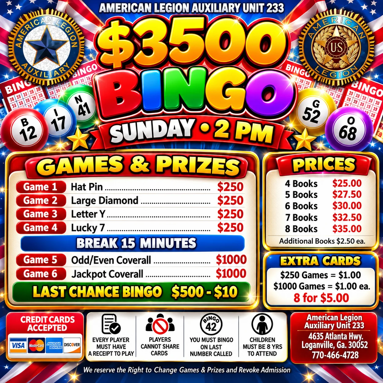
The Post's flyers have their own look — navy grounds, gold and green display type, high energy. That is deliberate and it works. Promotional material competes for attention in a Facebook feed; a website does not.

Treat the flyer style as a promotional sub-brand. It does not need to match the website's quieter field palette. Gold is the bridge between them, which is why a navy flyer sits comfortably inside a brass-accented card on this site.

Sunday Super Bingo flyer: $3,000 total payout, doors at noon, first ball 2 p.m.
The promotional sub-brand — loud, navy and gold, built for a feed.

Rules for flyers

  • Every fact on the flyer must also exist as text wherever it is published. The image is the artwork, not the content.
  • State the day, the time, and the price. All three.
  • Say whether the public is welcome — people assume otherwise.
  • Include the tie to purpose: proceeds support veterans and community.
  • Use the full Post name and address in the footer of the flyer.
  • Do not state a detail you have not confirmed. Leave it off instead.

Naming files

Descriptive, lowercase, hyphenated —bike-night-dj-scottie.jpg, not IMG_4821.jpg. Flyers live in public/images/events/.

Accessibility

These are not optional polish. The first rule is the single biggest failure of the previous website.

  • Never put information only in an image

    The previous site had event pages that were a single JPG and nothing else. Search engines, screen readers, and anyone on a slow connection got nothing at all. Flyers are artwork; the facts must also exist as text beside them.

  • Every image needs alt text that describes it

    Describe what is in the picture, not the filename. For a flyer, summarise the key facts it carries.

  • Keep text contrast at WCAG AA or better

    Many of the Post’s members are older. Run node _capture/tools/contrast.mjs after any colour change — CI fails the build on a regression.

  • Colour never carries meaning on its own

    Branch colours identify a service, but the branch name is always written out too. Navy, Air Force and Coast Guard blues are nearly identical.

  • Write link text that makes sense alone

    "Rental details" tells you where you are going. "Click here" does not.

Open decisions

Things this document cannot settle on its own. Post leadership should ratify each.

  1. Ratify the flyer sub-brand. This page treats the loud navy-and-gold flyer style as intentional and separate. If the Post wants one unified look instead, that is a bigger design decision.
  2. Photography. One image on the site is still an AI-generated placeholder — the Kroger Community Rewards graphic — and 52 images from the old site were permanently lost. Real photographs of the hall, the Grill and Post events would improve every page.
  3. Emblem approval route. Confirm who signs off on external material carrying the emblem — Post, Department, or National.

Questions about this document or the website: adjutant@gapost233.com.